Instagram Ad Report Card: Analyzing Timeleft's Unique Dinner Concept
In the crowded world of Instagram ads, standing out is key. Today, we’re diving into an ad from Timeleft, a company promoting unique dining experiences. They’ve taken a bold approach by contrasting their service with popular dating apps. Let’s see how this ad performs across several key dimensions, grading it with the fun of a report card!
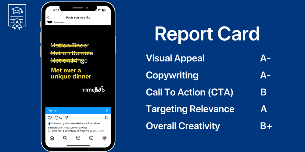
Visual Appeal: B+
The ad is visually simple yet striking. The use of a solid black background with bold white and yellow text immediately draws the viewer’s attention. The crossed-out names of popular dating apps—Tinder, Bumble, and Hinge—create curiosity and set up a narrative that makes you want to keep reading. The clean, minimalist design works well here, but it could benefit from a bit more visual flair or imagery to break up the text-heavy layout.
Comments: A solid effort, but it feels a bit too stark. A visual element—like an image of the unique dinner setting—might add warmth and further intrigue.
Copywriting: A-
The copy is short, clever, and straight to the point. By referencing well-known dating apps and then offering something different (“Met over a unique dinner”), Timeleft effectively positions their product as a novel alternative. The crossed-out text adds an element of surprise, which is always a great hook in advertising. The message is clear: this isn’t your typical dating experience.
Comments: Clever and engaging! The only improvement? Perhaps a touch more detail about what makes the dinner “unique” could be included to entice even more curiosity.
Call to Action (CTA): B
The CTA “Sign up” is clear and simple, but it’s not particularly compelling. While it tells the viewer what to do next, it doesn’t create a strong sense of urgency or excitement. A more action-oriented CTA like “Join the Dinner Revolution” or “Discover Your Unique Match” could have elevated this score.
Comments: Good, but it could use a bit more spice! A stronger verb or incentive might boost conversions.
Targeting Relevance: A
By comparing their service to popular dating apps, Timeleft is likely targeting a demographic that is familiar with and possibly fatigued by online dating. The ad speaks directly to those looking for a more personal, face-to-face connection, which is perfectly aligned with the service being offered. This ad likely resonates well with its intended audience, who are seeking alternatives to the digital dating scene.
Comments: Spot on! Timeleft knows their audience and speaks directly to their interests and frustrations.
Overall Creativity: B+
This ad gets high marks for creativity, especially with its clever use of crossed-out text to lead into their unique offering. It’s a simple yet effective twist that differentiates their product from the competition. However, the ad stops short of being truly memorable. Adding a bit more visual or emotional punch could take it from good to great.
Comments: Creative and catchy, but there’s room for even more innovation. Don’t be afraid to push the envelope!
Final Grades
- Visual Appeal: B+
- Copywriting: A-
- Call to Action (CTA): B
- Targeting Relevance: A
- Overall Creativity: B+
Final GPA: 3.5 (B+)
Summary
Timeleft’s Instagram ad is a solid effort that effectively communicates its unique value proposition. The clever copy and minimalist design work well together to grab attention and differentiate the brand from mainstream dating apps. With a few tweaks—particularly to the visual elements and CTA—this ad could go from good to outstanding. Timeleft has set the table; now it’s time to bring out the main course!
If you’re looking to elevate your Instagram ads with smart, targeted shoutouts, consider leveraging BeakonGage’s white-glove service to amplify your reach and make your campaigns go viral. Ready to ace your next ad campaign? Let’s get started!